By Melanie Merkling, mama of 1 and professional photographer
One of the most important things to think about when shooting a picture is the “composition.” Proper composition will draw your eye directly to the subject of your picture, creating a bigger emotional impact, making the photo more interesting. There are a few basic composition principles that will add the “wow” factor to every photograph you take.
1. Less is more.

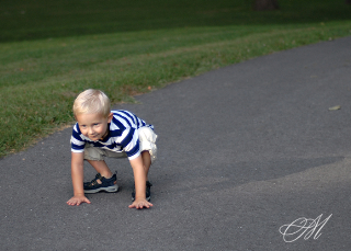
Remove as many unnecessary objects from your picture as possible. Lots of things in the background or around the subject will distract the viewer’s attention from the focus of the picture. This holds true with clothing, as well. When photographing children I always recommend avoiding clothing with pictures or wording on it because it detracts from the beauty and simplicity of childhood.
2. Create some contrast.
Most of us do this instinctively when decorating our home or putting together an outfit, but it often gets  forgotten when taking a photograph. Creating a contrast between our subject and the background significantly affects how much our subject stands out in the picture. So if the subject of your photograph is light, try to get a darker background, and vice versa. This is a great way to add some personality to your shots. For example, I’m thinking of all those great rain boots in bright colors. If your child has a pair of these or some other brightly colored object that symbolizes this moment in their life, dress them in some white, khaki or similarly light-colored clothing and find a sidewalk, driveway or something else with little color and take some pictures of them in those adorable bright green frog rain boots or with their bright red tricycle. The child will be the star of the photo, and that special childhood memento will “pop,” giving you a fun creative picture.
3. Be off-centered.
One of the most important rules when composing a more interesting shot is called the “Rule of Thirds.” Instead of always placing the subject of your picture right in the center, imagine your photo being divided into a grid with three vertical lines and three horizontal lines. Try to place your subject at one of the four points where the lines cross. (Some cameras even have viewfinders with a grid overlay as an optional feature. See example photo of “rule of thirds” below.) Add this tip to the two previous principles, and you’re well on your way to some awesome photographs!
For more info on Melanie Merkling or to contact her directly, click here to visit her website: MELANIE’S WEBSITE

